

It is the time when the technological things are currently in peak form. The growth is extensive and it is increasing every day.Mobile App Development – We Develop 100% secure Mobile Apps. Ask for a Quote Now. 350+ Apps Delivered. Fortune 500 Clients. 8+ Years of Experience. 100% On Time Delivery. 20% Discount for Startups. 50+ Full Time Developers. The growth can be seen high in the online segment. Catching the target audience is the ultimate aim of every online marketer these days.
Catching high traffic to the server is the ultimate aim of every online site. The demand is there today but the competition is high too. Website owners and publishers are adopting the latest techniques in the business.
For that purpose, they are taking the help of several tools for their online site. The main reason for that is to hit a big chunk of the crowd. That is why you, as a website owner, need to make sure that your website must be available for every platform. Some people prefer to surf website from desktop and some prefer to access from mobile.
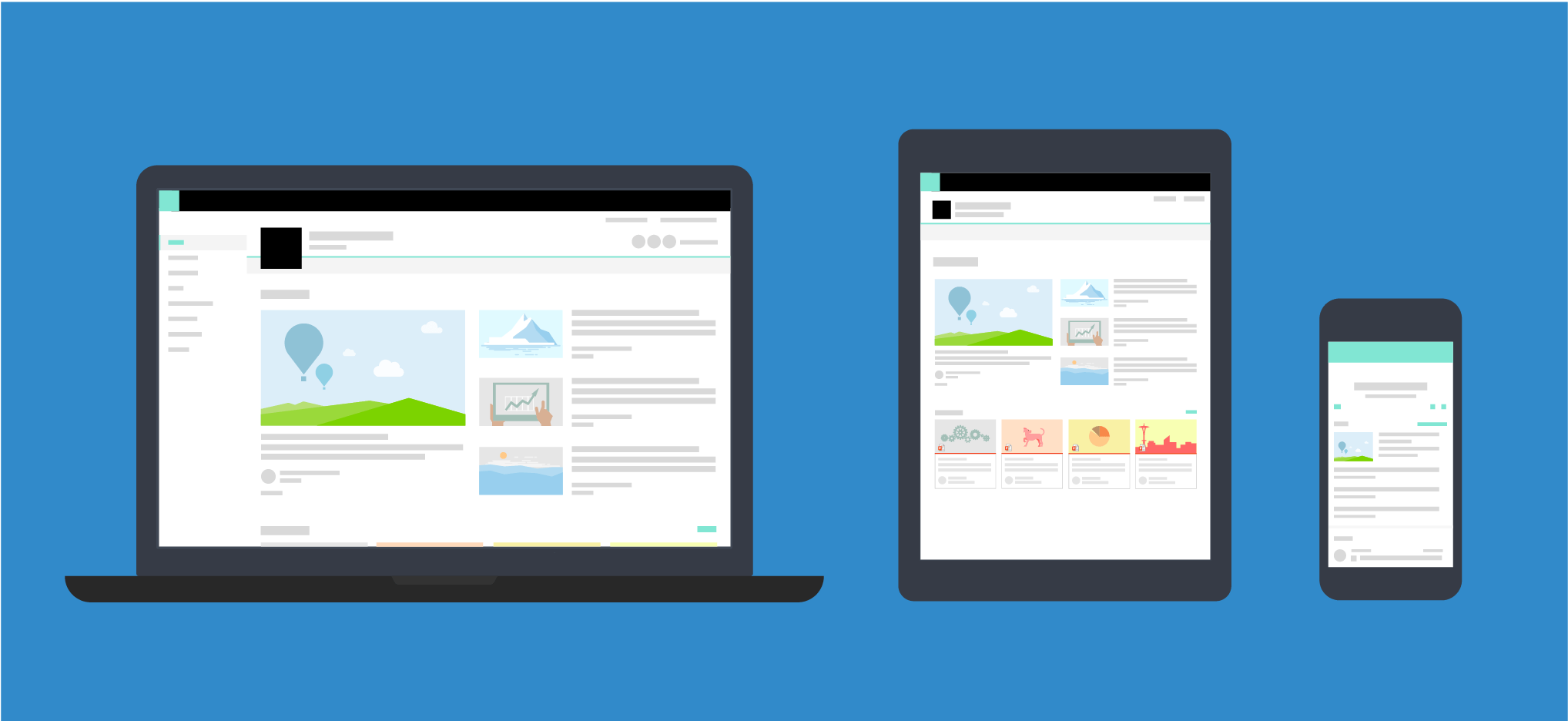
There are differences exist between a responsive website or a separate mobile website. If you are really into the online business segment and planning to open a new website then make sure to know the differences between a mobile site and a responsive site.
It is the utmost responsibility of any digital marketing services in India to make the perfect website for the viewers.
Here are the top 5 differences.
- Structure of URL
This is the main difference between a mobile site and a responsive site. The URL structure is something that shows how and why a separate mobile site will always be beneficial than responsive website design.
The responsive website designing is the root domain and the core site designing. A mobile site exists in any subdomain or it is a different URL than the core root domain structure. The difference can be seen while viewing the website from separate gadgets.
The mobile application development india will be ideal for operating from mobile apps. While the responsive site is ideal for desktop, laptops.
But here a problem lies as Google may get confused about which website is for which one. There will be a different URL for the mobile site and a different URL for other devices. There is a high chance of duplicating content issues.
Here you need to take the help of canonicalization so that Google knows the URL is basically a master copy of the real webpage for different platforms.
- Difference in traffic
As a separate mobile site stays on the subdomain of the root domain so it is obvious that your online business will have two different websites. That means there will be differences in content too.
The contents stay in the main domain and if you are having a separate mobile website then you must have separate contents for the website too. A mobile website is the smaller version of a responsive site.
When it comes to ranking the separate mobile website, it may not get the ranking as much as the core responsive site. A separate mobile site may be very small, containing only 6 to 8 pages for mobile use only.
Make sure to take care of both of the websites properly. You need to give the same hard-effort in both of the websites to be certain that there are no mistakes, no repeating of contents. You need to even update it on a daily basis.
But a separate mobile site will catch lesser traffic than a responsive website. This will lead to a huge loss. As a website owner, it is your ultimate aim to catch high traffic on your website server and this will not possible for the separate mobile site.
The traffic will always be high for the responsive website.
- Differences in size
A responsive site is the ultimate aim of any website developer. Whenever a web developer makes a website for the audience, it is made as a responsive site. The responsive site can be accessed by desktop users only.
However, most of the users are preferring to surf the web via mobile these days. Today 70% of people use smartphones extensively. So, there will always be a demand for websites to surf abruptly on smartphones.
Having a mobile site means it will be fully optimized for mobile phones only. The mobile sites can be accessed by desktops too but the size of the entire website will look small.
The same can be applied for responsive sites. The responsive sites can be accessed by mobiles but the size will be bigger than the screen. The screen-fit issue is very much real.

- Speed differences
It can be said without any doubt that the speed difference between a mobile site and a responsive site is real. The speed gap is huge. A responsive website has a higher speed than the mobile site.
Starting from loading the webpage, surfing the entire website, to getting results – everything is faster on responsive sites. On the other hand, you will face lags, slowness while experiencing the mobile site.
As a result, the user experience will get hampered quite a bit if you are switching from a responsive site to the mobile site.
- Supporting browsers
The number of supporting browsers matter because there are many new browsers available in the market. For a responsive site, it supports quite a high number of browsers. The situation is not the same for mobile sites. It supports a lesser number of browsers.
If a responsive site is developed then it will be supported by a majority of desktop browsers like Chrome, Firefox, Opera and others. But if a mobile site is developed then it will be supported by fewer browsers.
A mobile site must be optimized for the different browsers and it is very hard for the mobile site to optimize it for each and every browser. Optimizing the browser is relatively easier on a responsive site than the mobile site.
Here are the top 5 differences between a mobile site and a responsive site.
If you want your company to become one of the top digital marketing services in India, then you must know the differences between a mobile site and a responsive site.

As a digital marketer, it is your utmost priority to target the audience first. If your target audience will be based on basically desktop users then go for a responsive site only. But if you want to catch the smartphone users too, then a mobile site is mandatory for your business.
In modern-day, the need for a mobile site and a responsive website are important in every aspect of catching the audience. It is important for every online business to have an optimized website for desktop users and smartphone, tablet users.
Go through the points carefully and come up with the ideal site for your business.
Best of luck!
People also ask
Q.1 What are the best app development companies in India?
A.1 Logicpin Technology
Q.2 How much does it cost to develop an app in India?
A.2 Starting with 2000 INR
Q.3 Which is the best company for web and mobile application development services?
A.3 Logicpin
Q.4 Why to go only with Top Mobile App Development Companies in India ?
A.4 Cause they are genuine who always ready to help you afterword of the project complete also.
Q.5Which apps are made in India?
A.5 Both Native and Hybrid
For Examples
-
1) Word processing software. …
-
2) Spreadsheet Software. …
-
3) Desktop Publishing Software. …
-
4) Database Software.


